Outdoor Window Design
Role
Graphic Design
H Mart Calgary
Overview
As the sole designer, I created the outdoor window design for H Mart store located in Calgary, Canada, as per their request.
The purpose of creating this window graphic design was for delivering visual joy to customers and for being differentiated from their local competitors.
Timeline
May 2023 -
June 2023 (3 weeks)
Tools
Figma
Illustrator
Photoshop
Background
H Mart is one of the biggest Asian grocery retail stores in the North America. One of their branches located in Calgary, Canada, wanted to create new design for their outdoor windows.

Problem Statement
A store manager of the branch was not satisfied with the old design and requested a brand new design.
After receiving the request with the photos of the old exterior of the store, I discovered some issues and came up with two solutions:


Old exterior window designs.
Issue 1: Color/Layout of the Window Design
-
Windows partially covered by light blue sheets
Some parts of their windows were covered by light blue sheets making potential customers feel the store is closed.

Old exterior window design with light blue sheets.
Issue 2: A beautiful interior is not visible
-
Windows are fully covered with designs
This store was opened only a couple of years ago, and it has a beautiful interior compared to its local competitors. However, by covering their windows fully with graphic designs, it gives their potential future customers a less chance to get interested to be impressed with what's inside.
Compared to the windows under the yellow circle on the below picture, the store looks closed and less interactive.

Old exterior window designs with fully covered windows
Issue 3: Graphic Designs
-
Graphic designs doesn't show the unique characteristic of the store
The food images they used for their window designs are not differentiated from any other grocery markets. Since there are only three H Mart branches in Canada, it could show more imagery of Asian grocery market in the design.
Now, here come the design solutions:
-
Change the layout of the designs or remove the light blue sheets from the windows.

New window layout with revealing the inside of the store.

New window layout with removing the light blue sheets from the windows.
2. Recreate designs that can show the unique identity of Korean grocery market in Calgary, Canada.

First draft of the new design including Korean and Calgary factors.
The store made a decision to keep the old layout and agreed to remove the blue sheets instead.
In terms of the concept, they were happy with it, and we proceeded to the next step.
Design Process
Similar factors from two different cities.
At the beginning of the design process, through the research, I noticed lots of similarities between Calgary, Canada and Seoul, South Korea. I believed showing the factors of these two cities will be the best way to show the identity of this store. With this concept, I believed that it would be joyful to show their customers / potential customers the comparisons and contrasts between these two cities.
Here is the list of similar factors I found in those two cities:
1. Sculptures in the cities

The Wonderland Sculpture in Calgary

The Great King Sejong Sculpture in Seoul
2. Towers in the cities

The Calgary Tower in Calgary

N Seoul Tower in Seoul
3. Domes in the cities

Scotiabank Saddledome in Calgary
Jamsil Arena in Seoul


4. Mountains around the cities

Calgary Mountains
Namsan (Mount Namsan)
5. Sculptures in the cities

Peace Bridge in Calgary

Seongsu Bridge in Seoul
Reference
The reference I used for this project was, Irworobongdo (일월오봉도), a traditional Korean landscape painting of the sun and moon.
Since it is the most well-known Korean traditional landscape painting, I believed it would be the perfect composition to use to represent the identity of the store as a Korean grocery market.
In addition, having a moon and sun on the same design could represent the daily routine of a grocery market that opens early in the morning and closes late at night, as long as the time differences of two different cities, Calgary and Seoul.


Reference image and a draft of the new design.
As a result, I came up with the design above. I placed the mountains of each city on the back of the work as it looks like on the reference painting, put the rivers of each city in front of it, then the buildings and sculptures of each city in the front of the work.
Design Decisions

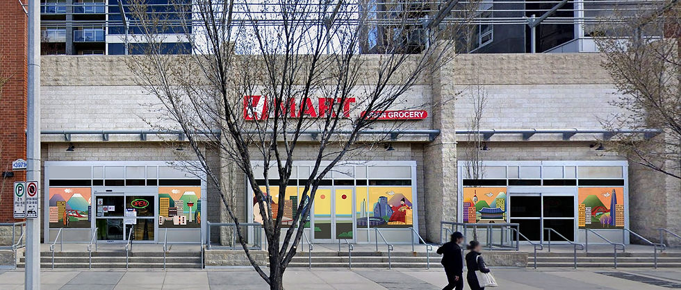
Final design.
The image above is the final design of this project.
However, due to the layout of the store's windows, I had to replace and adjust the design slightly like the image below:

Final design with a requested layout


Detail views of each design.